

Trends will always come and go – but the beauty is that, each time they do, they’re reinvented and rediscovered in ways that give them brand new look and identity. The use of transparency, in both fashion and interior design, has been evolving for decades of course, but I absolutely love its current incarnation: it’s modern, it’s bold, and can be a truly striking element of contrast when paired with more traditional decor features. The wedding industry is riding the wave of see-through mediums, and it’s awesome: perspex, lucite, acrylic, resin, plexiglass, and glass can now be found in any part of the narrative, all the way from indulgent stationery, to contemporary floral installations, to eye-catching bridal accessories.
The natural minimalism of the material can blend in beautifully to highlight the other elements of the decor – for example by creating an “suspended” effect for your floral centrepieces – or can be used as a focus piece of art in its own right – like menus containing delicate pressed flowers. The versatility of it means that it can either complement or contrast the aesthetic concept at the heart of the wedding design, and still be chic, stylish, and unexpected.
We have the lovely Cathy from Willow Beau giving us some tips on how to explore accents of transparency in your wedding stationery, and showing us some stunning examples of her work ♡
E X P E R T T I P S
A Stationer’s View: Cathy from Willow Beau
Transparency has been a hugely popular trend as of late, and it doesn’t appear to be disappearing any time soon! From clear acrylic and glass welcome signs, to translucent vellum wedding invitations, using see-through stationery elements as part of your big day can add a real sense of style and elegance.
-
- Stationery and Photo by Willow Beau
-
- Stationery by Willow Beau, Photo by Catharine Noble Photography
-
- Stationery and Photo by Willow Beau
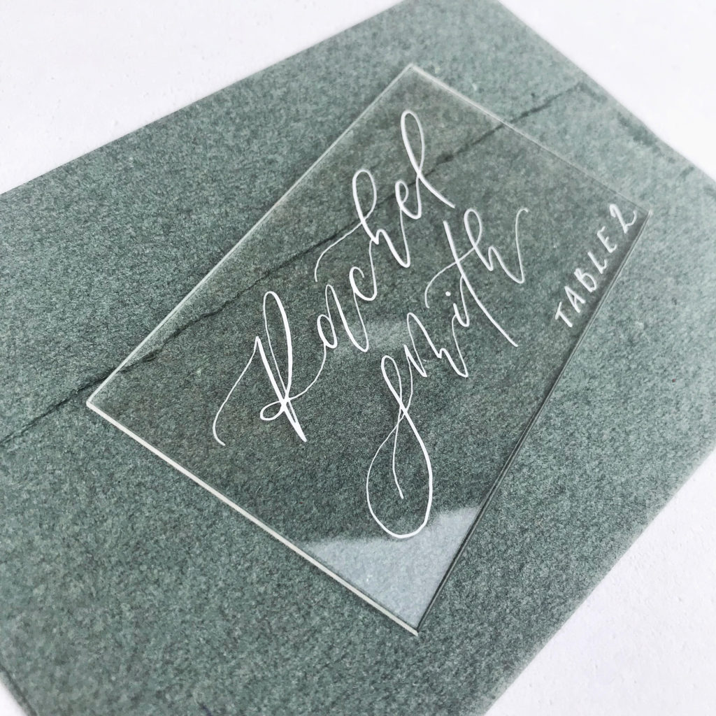
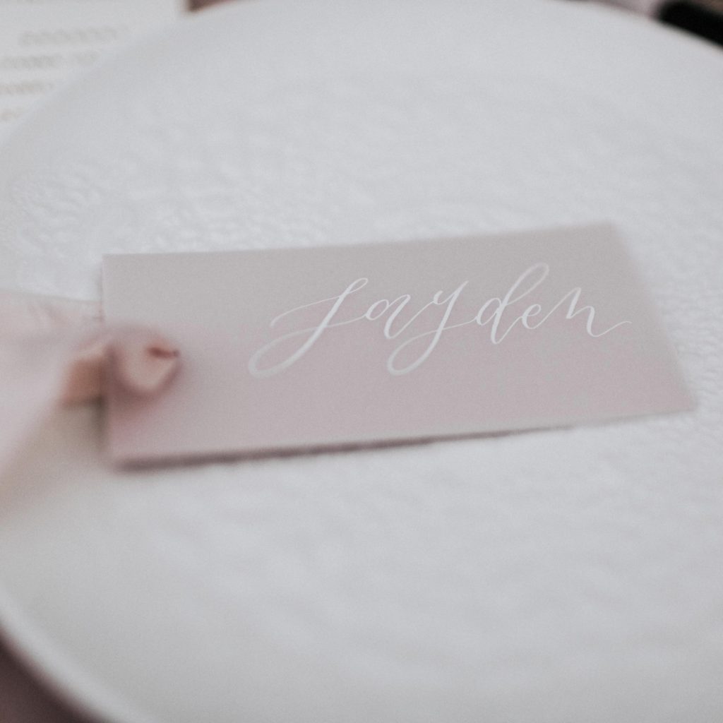
When I work with these kinds of materials, it’s always about the layering. You’re starting with a completely blank canvas so it’s important to think about what you want the eye to be drawn to, and what you can use to enhance or frame your wording. I love to use bright white ink to accentuate my calligraphy when working with transparent materials. It’s then down to a stylist or the bride or groom to dress their place settings with this is mind. For example, you could layer an acrylic place card on top of the guest’s plate or lean it against an element of the setting that you wish to highlight. Consider the positioning of your piece, all the while bearing in mind the texture or colours that will become a backdrop to the calligraphy and make the ink pop.
-
- Stationery by Willow Beau, Photo by Belle Art Photography
-
- Stationery by Willow Beau, Photo by Cathy Dixon Photography
-
- Stationery by Willow Beau, Photo by Terry Li Photography
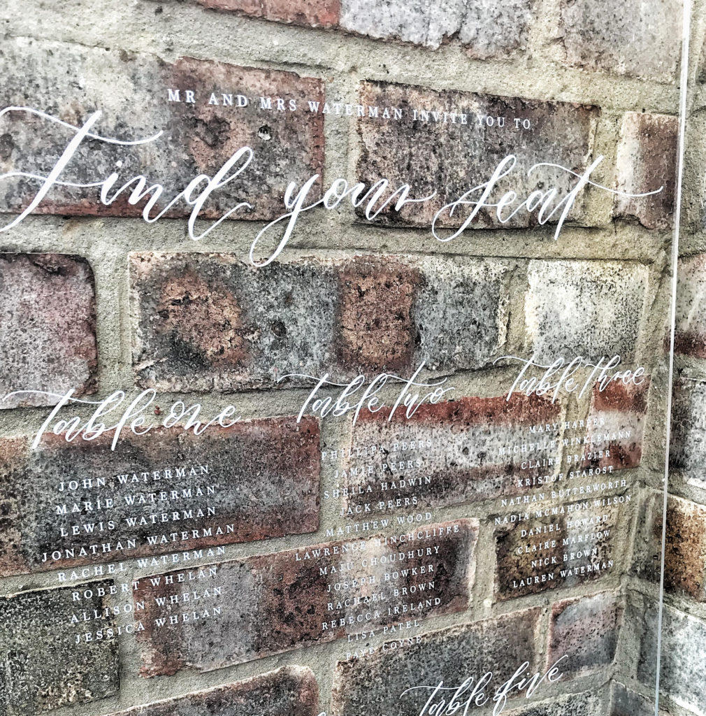
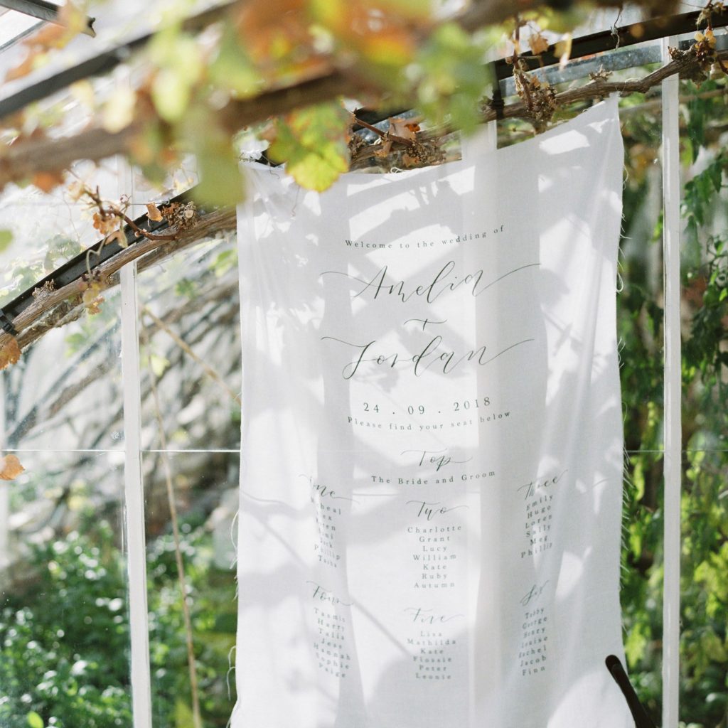
Working with translucent materials, the same principles apply. When using vellum, for example, I often pair it with or layer it on top of other papers with interesting textures and pleasing colours that will contrast and compliment the calligraphy. Using other translucent materials such as very fine muslin silk for elements such as signage and table plans can also make for some interesting layering potential. When set against natural light, the muslin becomes semi-transparent, and the shadows and details of the background shine through. This effect is so easily achieved, with some hooks or fishing wire and with the layering of front and foreground, creates a stunning ethereal effect.
Be sure to ask your stationer and stylist for useful tips on how they can help you create and style beautiful see through pieces for your special day!
Thank you so much, Cathy! That’s a really fantastic point she’s made – transparent material can be a powerful way to focus attention on a particular detail, colour, or texture, and is only as effective as what it’s paired with, whether it’s to complement or contrast.
Below is a round-up of some more of my favourite examples of the creativity and breadth of this type of design, which I hope you’ll love as much as I do ♡
Flowers
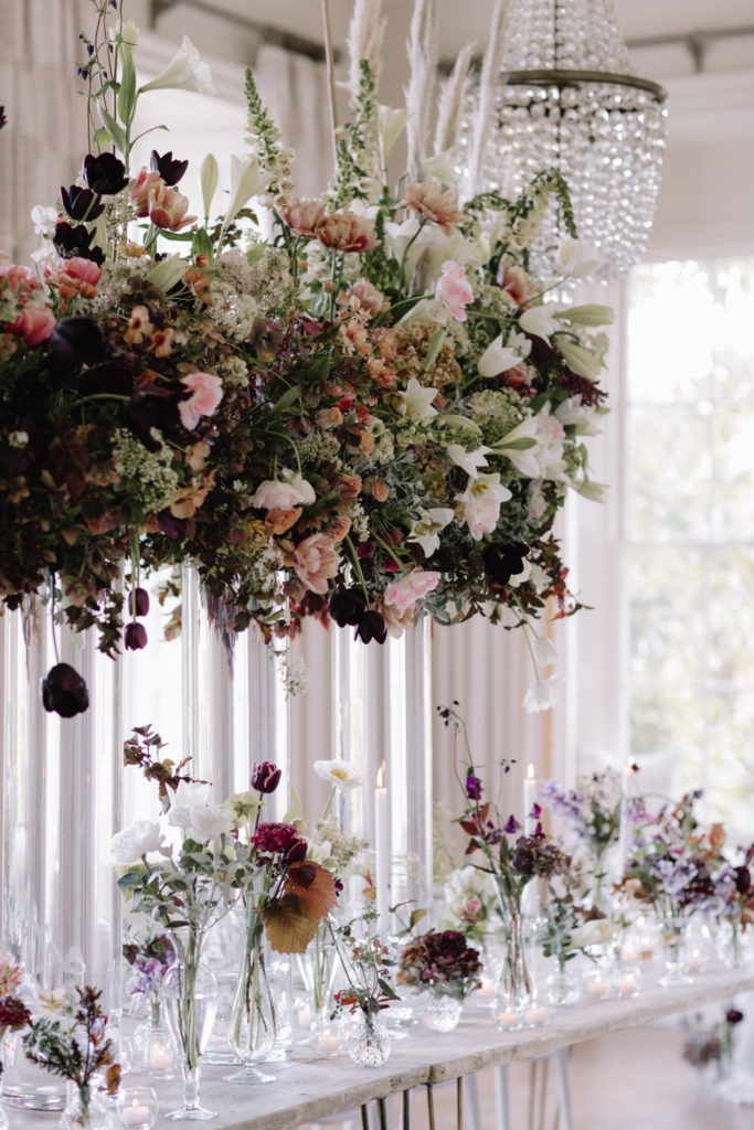
Photo: Rebecca Goddard Photography
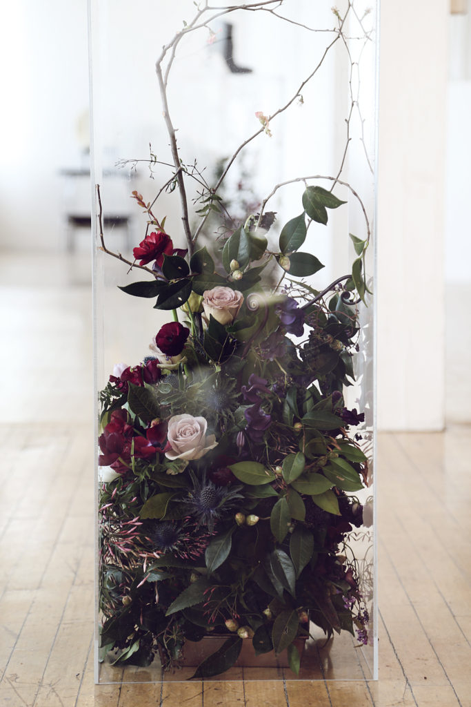
Photo and florals: Putnam and Putnam
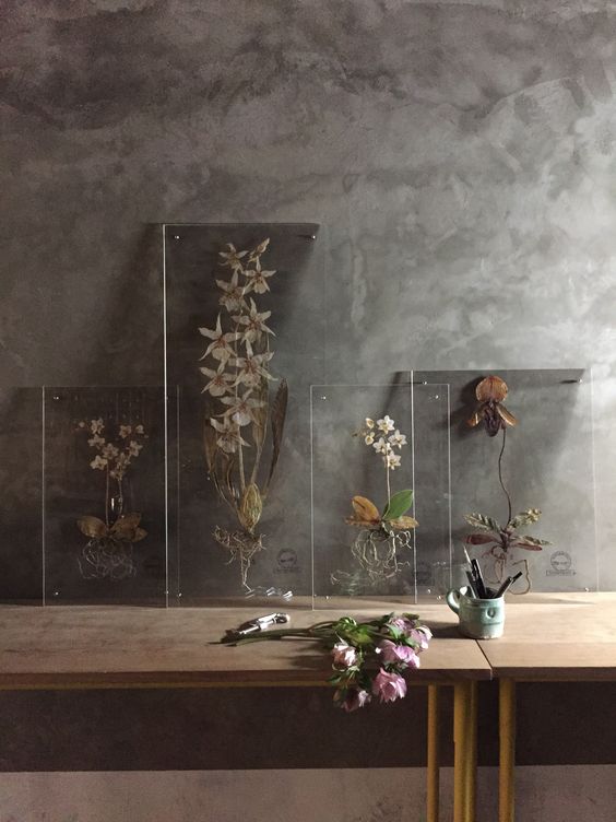
Photo and flowers by: Hayden Blest
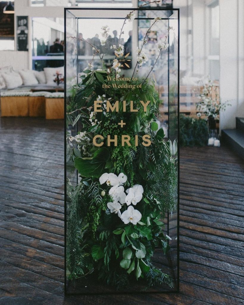
Photo: Bayly & Moore
Invites
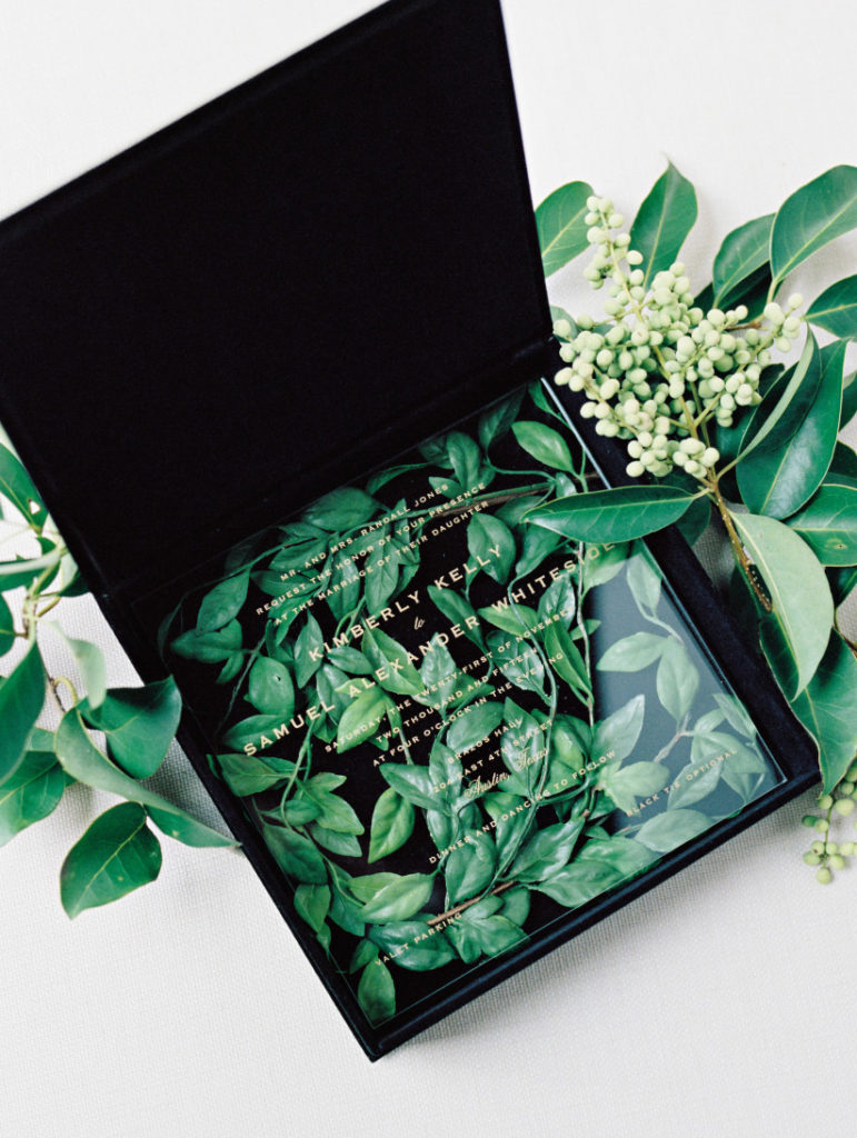
Photo: Ryan Ray Photography
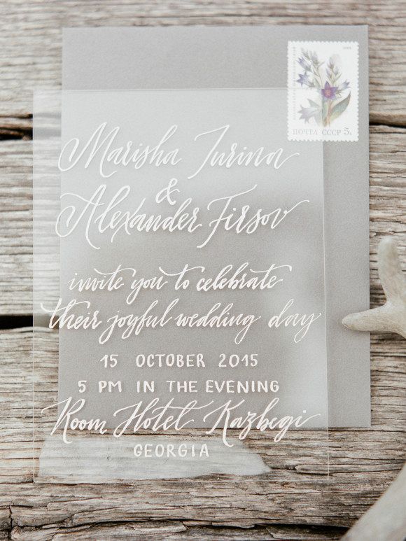
Photo: Elena Pavlova
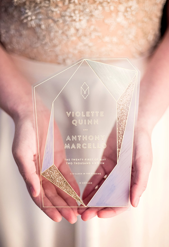
Photo: Gerber + Scalpelli Weddings
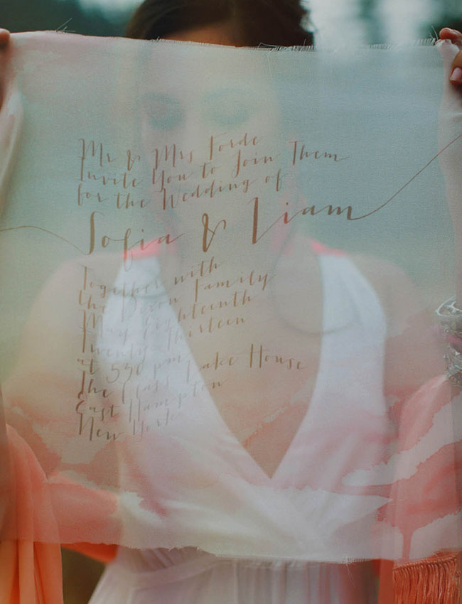
Photo: Milou and Olin
Table Plans
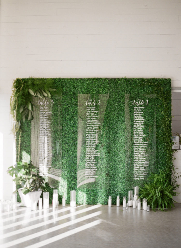
Photo: Matthew Moore Photography
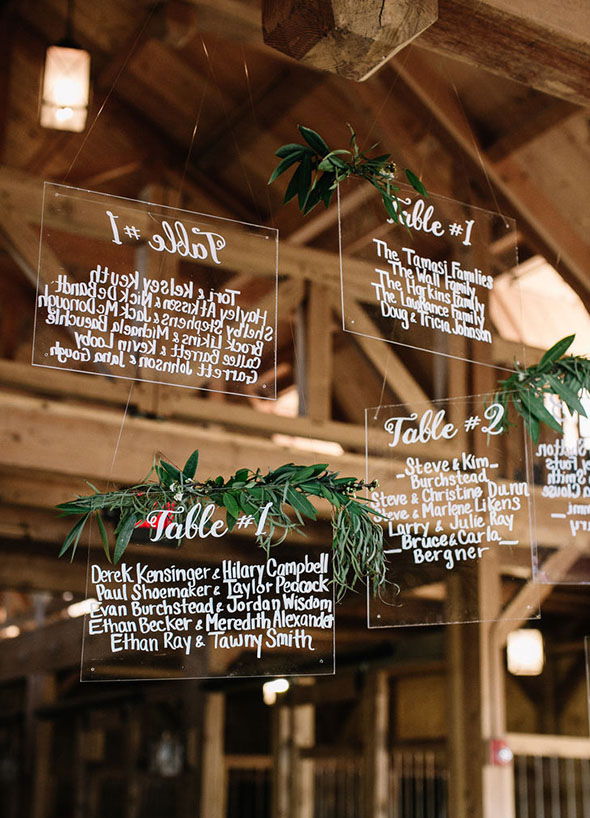
Photo: Steven Michael Photography
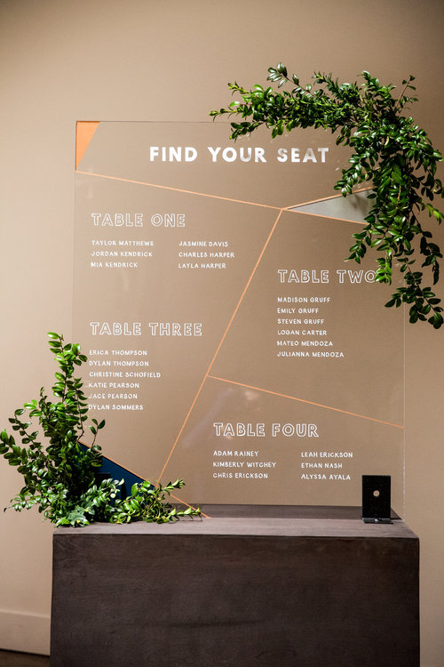
Photo: Maggie Marguerite Studio
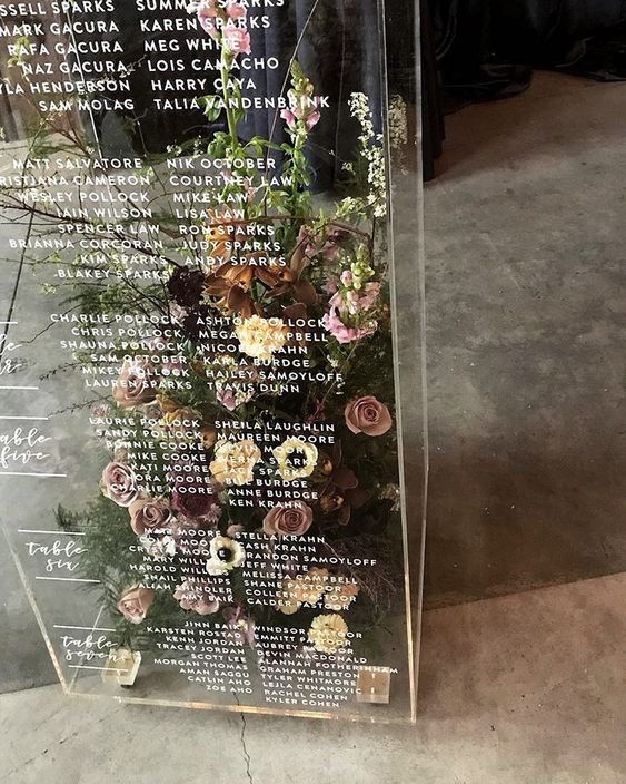
Photo and Florals: Celsia Floral
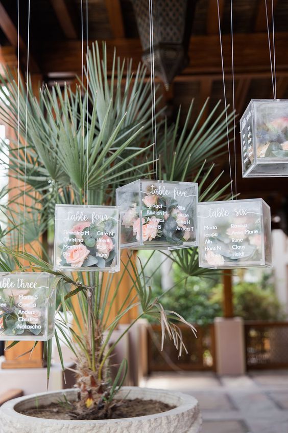
Photo: Maria Sundin
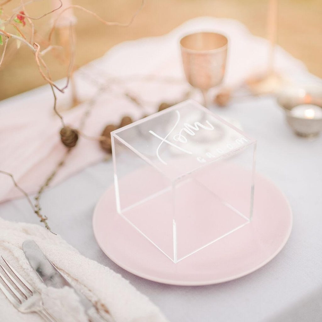
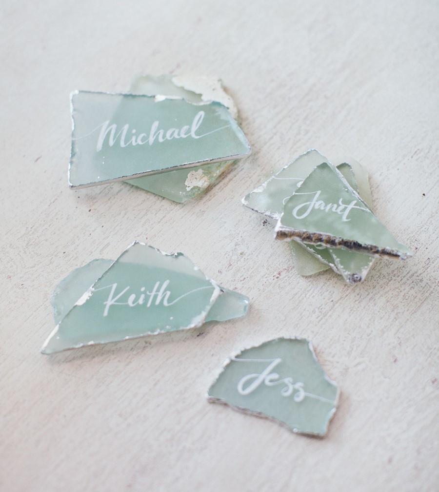
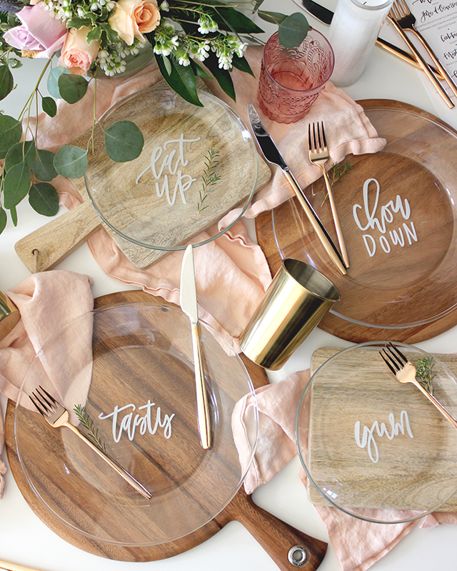
Place Cards & Escort Cards
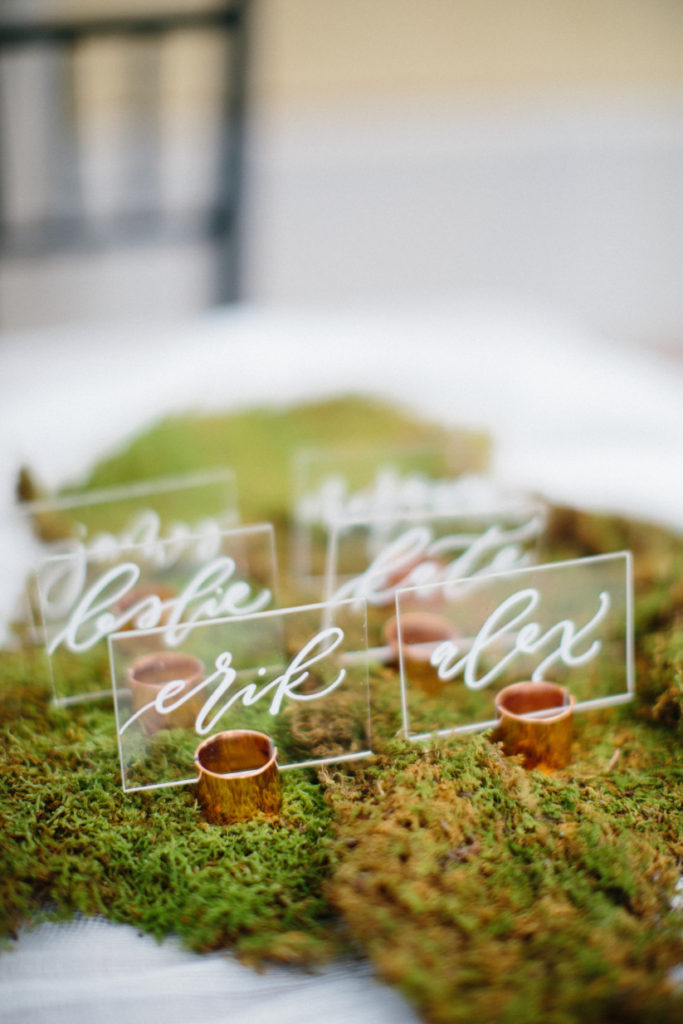
Photo: Dani Stephenson
Source: Style Me Pretty Living
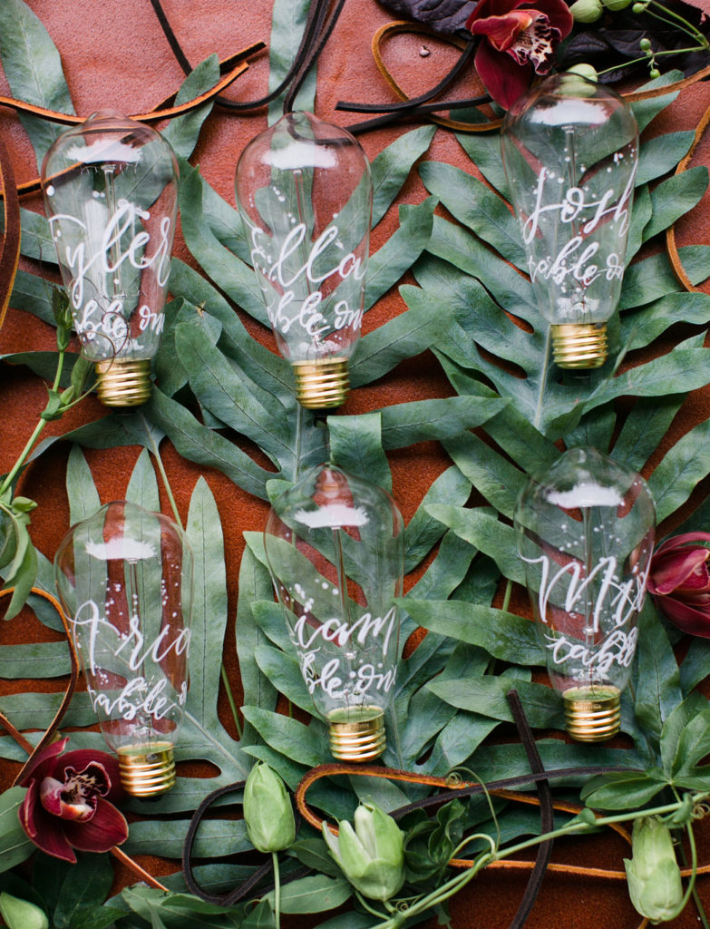
Photo: Mi Belle Photographers
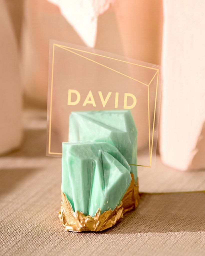
Photo: Gerber + Scalpelli Weddings
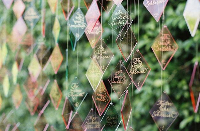
Photo: Braedon Photography
Menus & Signs
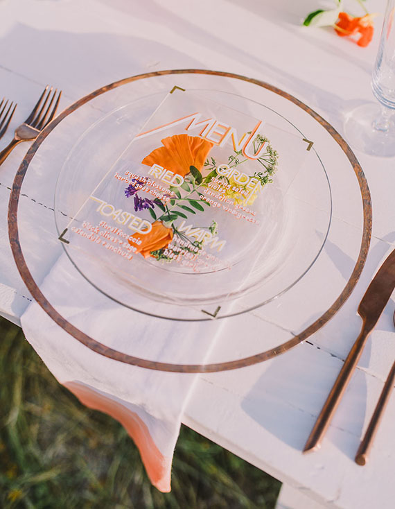
Photo: Michelle Roller
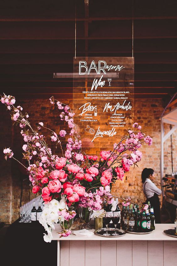
Stationery by: Ashdown & Bee
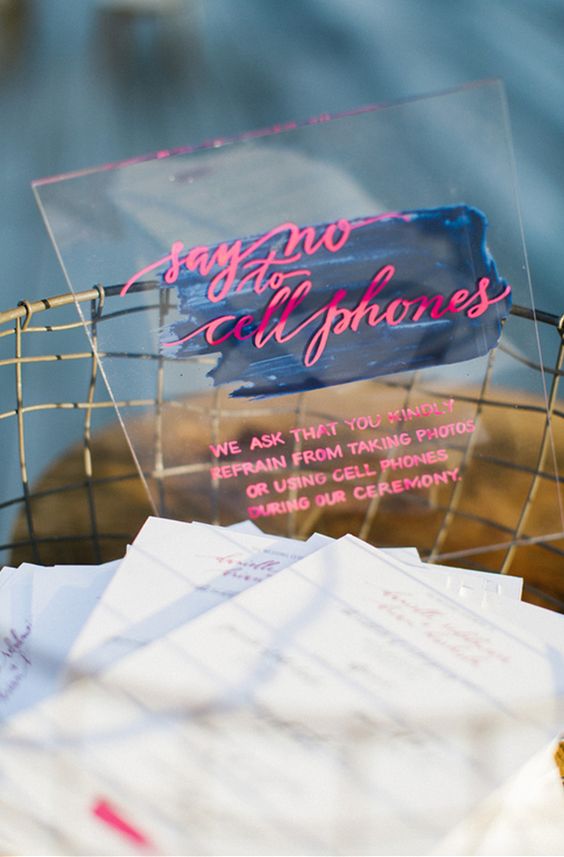
Photo: Erin McGinn
Decor
Source: Oh So Beautiful Paper
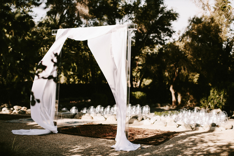
Photo: Lauren Scotti
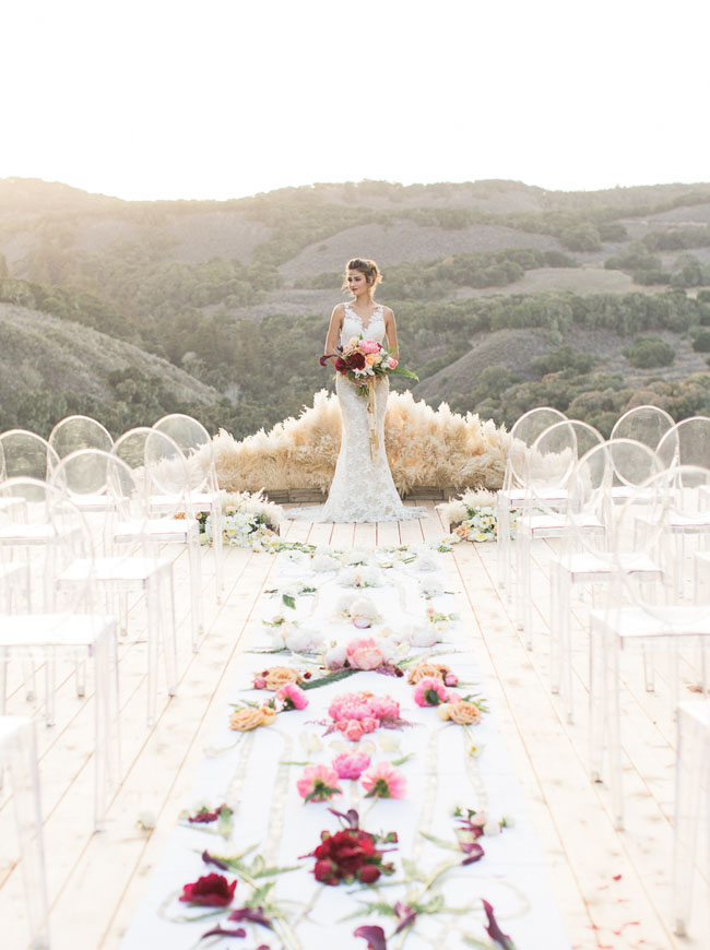
Photo: Carlie Statsky
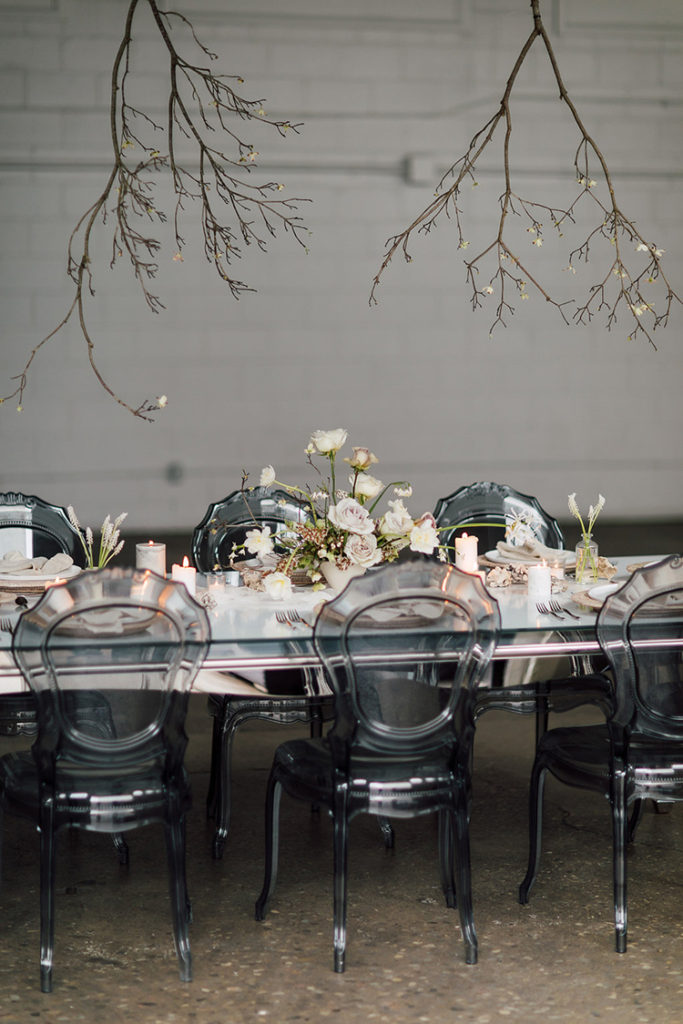
Photo: Purple Tree Wedding Photography
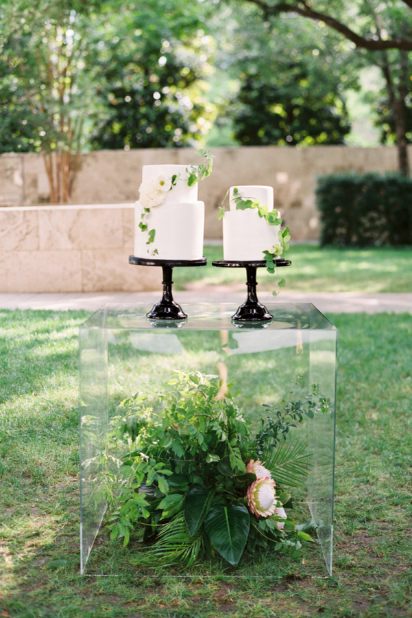
Photo: Sarah Kate Photo
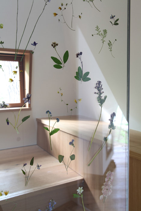
Photo: Hiroshi Nakamura & NAP
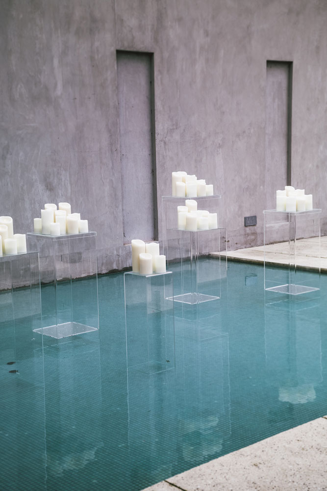
Photo: Hikari Photography
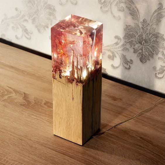
Photo via Eduard Locota
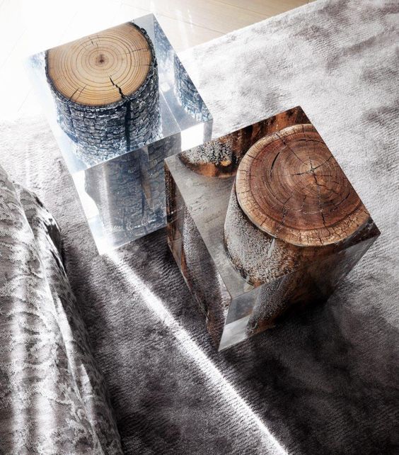
Photo via Interior Style Hunter
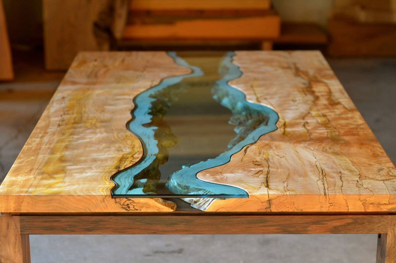
Photo via Greg Klassen
Acrylic Shoes & Accessories
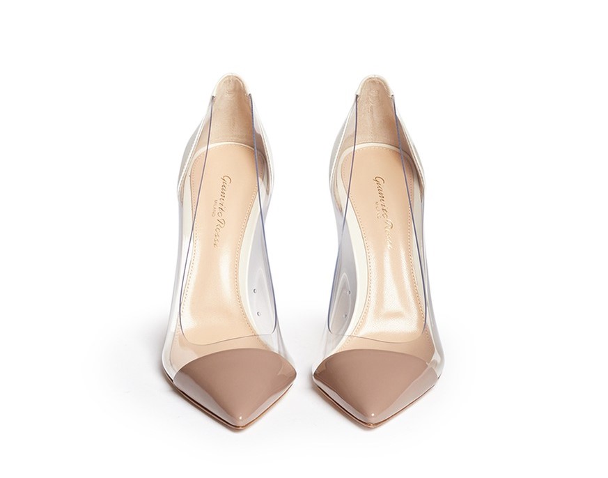
Shoes by Gianvito Rossi
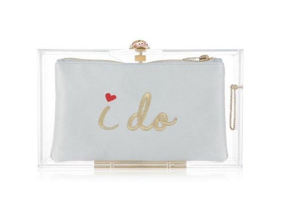
Clutch by Charlotte Olympia
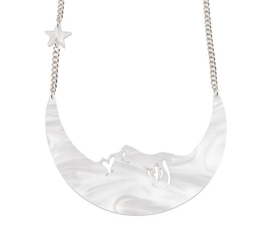
Necklace by Tatty Devine
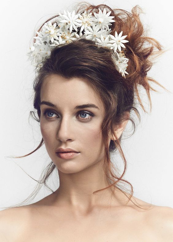
Headpiece by Luna Bea
I hope you enjoyed all the fabulous transparencies, and found some inspiration for your wedding day! If you want to discuss some ideas, or need some help in bringing an acrylic masterpiece to life, get in touch so we can start brainstorming all the pretties ♡
Yours,
Valentina


")


